Lipogen helps you to get more out of life with top-quality nutritional supplements to promote optimal brain health and function. I was part of a project to redesign and rebrand the online shopping experience for Lipogen products with the mission to develop a distinct, vivid, and engaging visual language that helps translate their message to their customers.
My Role
Prototyping Website & Product landing pages UI interactions Mobile design Assist in branding
Duration
2018 – 2019
The Objectives
Why redesign?
1. Outdated website does not match the new product design
2. Need to differentiate from competitors
3. Reflect the new products and values with better content
4. Expand the online presence
5. Reach out to new potential clients
6. Increase sales and encourage growth.
Solutions
Colors that stand out
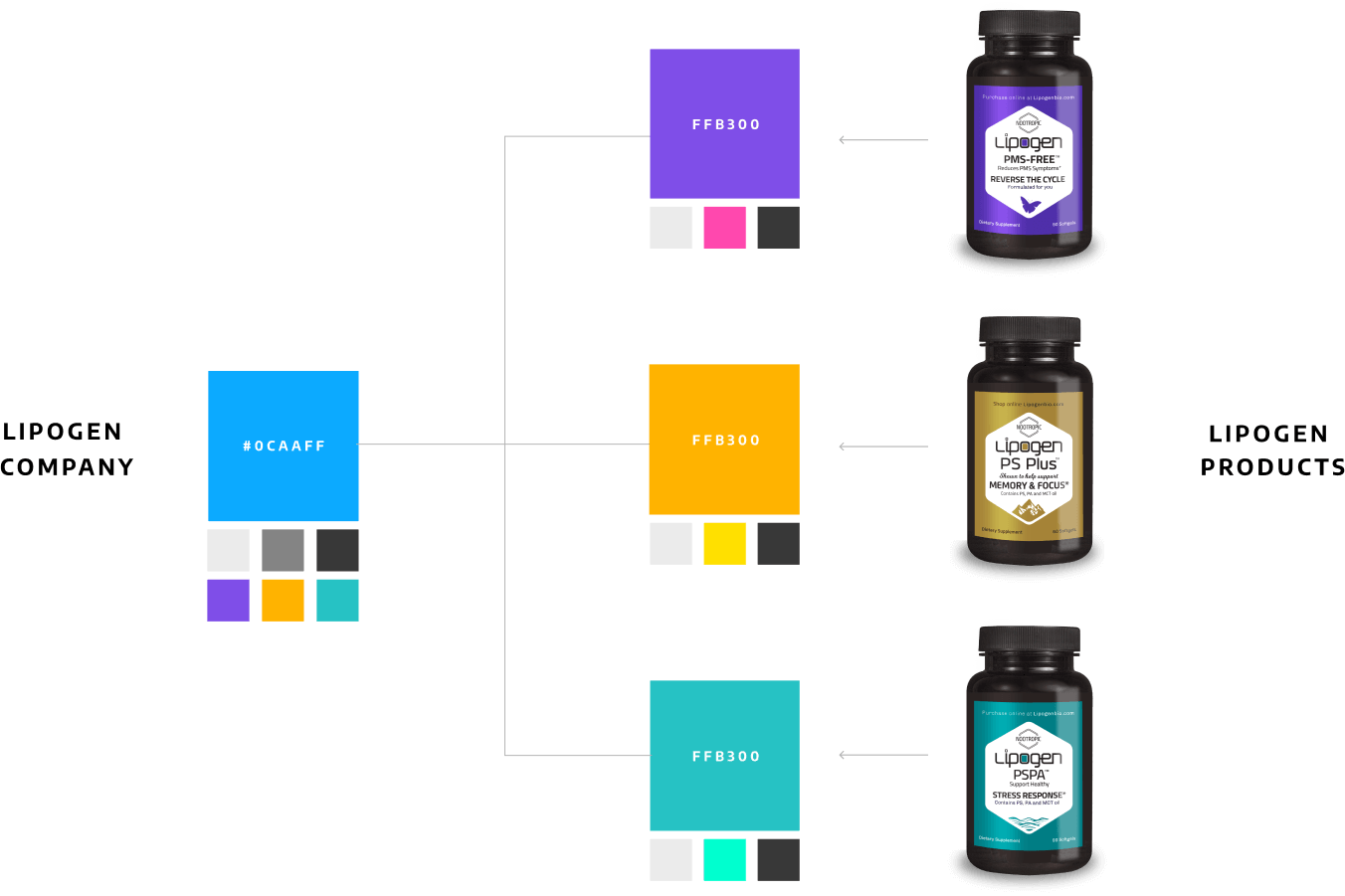
Each Lipogen product focuses on different aspects of brain health and targets different customers. To easily distinguish between the products, each is represented and recognized by its own unique color. Changing that would be a bad idea, and might harm the existing identity of the brand. Instead, we agreed the best approach would be to keep the original color palette but make it more vivid, bold, and modern.
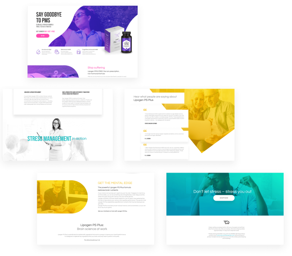
Emphasis on imagery communication
The imagery is one of the most emotional elements of a brand design. To better communicate the brand message, we wanted to reflect on situations that people experience when their brain is at peak performance – people showing positivity and confidence, concentration at work, focusing on their daily life activities, and being at the top of their game.
Customized Illustrations
We’ve designed a set of illustrations to add a pinch of style and creativity to the interface. This contrasts and balances out the strong photorealistic imagery and heavy textual content, as well as making the UI easily recognizable in a competitive field.
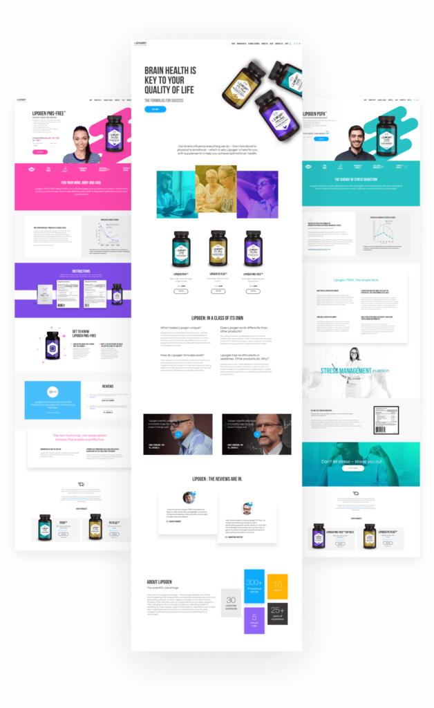
Thoughtful website interface
The main page interface lets users quickly catch the message, review the benefits of the product, and make a purchase. It unifies the product colors with emphasis on the company’s main blue color.
The product pages focus and give all the details about each product while maintaining harmony with the general brand identity. The same layout is applied for all product pages to keep the consistency, but with the use of colors and specific product imagery, we built a clear separation between them.
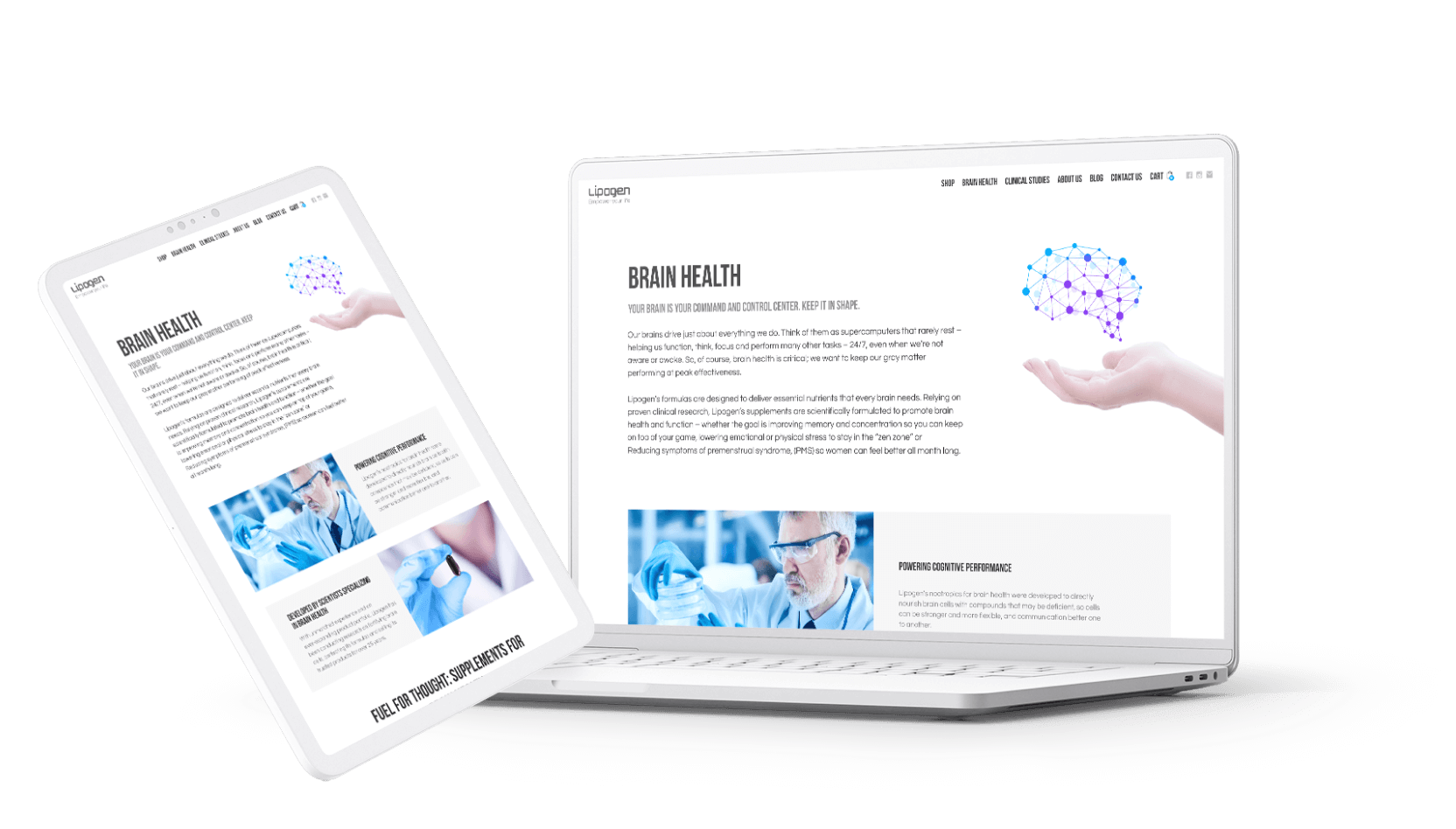
Mobile and tablet compatibility
To make the website usable from any device, we adapted the pages keeping in mind the nature of mobile interactions.
Learnings
This project was in the making for more than a year and required many iterations along the way. The competition in the field of supplements served as a challenge to us. We had to make sure the new website design sticks out in the crowd and conveys the benefit of the products over others in the market. Designing such a complex website with heavy content and many inner pages challenged me to be more mindful of the business and user goals, pay attention to the little details and maintain an easy journey for users to interact with.